Udarbharan
A Traditional Indian Cloud Kitchen app designed to simplify online ordering.
Case Study Contents
Project overview and challenges
Ideation & Concept
Development & Implementation
Results
Design Brainstorming
Research phase
Project Overview and Challenges
BACKGROUND
For this project, I built an end-to-end mobile application for a cloud kitchen based in Aurangabad, India. With the urbanization of the city, fast food has infiltrated the food scene. Udarbharan curated a special menu using family recipes passed down through generations that are commonly made in Maharashtrian homes. This was aimed to help connect people to their culture. They prioritize serving healthy food made with fresh produce to encourage better nutrition and be environmentally conscious.
I met with the clients and here are the business goals we discussed:
Enable users to see the menu online via the Udarbharan app
Provide the ability to contact via WhatsApp to place an order
Enable users to pay online for the order
Target audience- people going to work and school (morning crowd who don't have time to cook)
I assume that if these features were made available on the app, their business would be accessible and gain more visibility hence improving their revenue.
DESIGN CONSTRAINTS
Language barrier- Given my fluency in spoken Marathi but intermediate reading and writing skills, crafting the menu in Marathi posed a time-consuming challenge, requiring thorough translation and client verification to ensure alignment with expectations.
Dual Language- I chose to design everything in English for better accessibility to non-Marathi speakers, but it meant extra work—translating and redesigning to keep things looking good and working well despite the script differences.
No web developer- In the absence of a dedicated web developer at this stage, the project remains in the design phase, allowing flexibility for future integration.
Photography- As professional photography resources were unavailable to Udarbharan, I sourced images online to accommodate the current limitations.
Limited resources- The challenge of accessing limited online data from Aurangabad, India, constrained my ability to gather comprehensive insights into local food habits and preferences, influencing the design process.
Understanding the competition and user needs
RESEARCH OBJECTIVES
How can we increase demand for mobile ordering services for food?
Do target consumers have the time to pick up food before going to work/school/college?
What is the demand for home-cooked, traditional, grandmother recipes vs junk food?
Do people prefer online order and pick up or walk-in and order?
RESEARCH GOALS
Simplify ordering food through Udarbharan on a mobile
Connect orders made online to notify the chefs/kitchen via WhatsApp
Provide information necessary to the user quickly to simplify their decision to order with Udarbharan
Understand current food trends in Aurangabad through user interviews
Align with company vision and goals
Understand the demand for meals on special occasions like (act of worship) puja, Satyanarayan puja, etc.
METHODOLOGIES
Secondary Research- Delving into market insights, local food trends, mobile-centric demands, and the thorough analysis of customer feedback and reviews. This method enabled a deeper understanding of consumer behavior, crucial for UX/UI design decisions.
Competitor Analysis- Gathered available data on Aurangabad's cloud kitchens and food delivery services via secondary sources. Analyzed competitors' websites, menus, pricing strategies, and customer reviews to identify market gaps and opportunities for the project's strategic direction.
User Interviews- Understand needs, preferences, and goals when ordering food online
Market Research- Gather information about local food preferences, popular dishes, and ordering habits specific to Aurangabad
Insights from the Research Phase
SECONDARY RESEARCH
Although I could not find much data online about local food habits and preferences I was able to gather some insight like information about the demographic, conventional wisdom, current trends, target audience, etc.
COMPETITOR ANALYSIS
I chose 2 indirect competitors- Swiggy and Zomato to understand the online ordering and delivery process. I looked at 2 direct competitors to understand how they are functioning regionally as a private cloud kitchen without any partnerships with companies like Uber Eats. This helped me understand what was working and areas to grow.
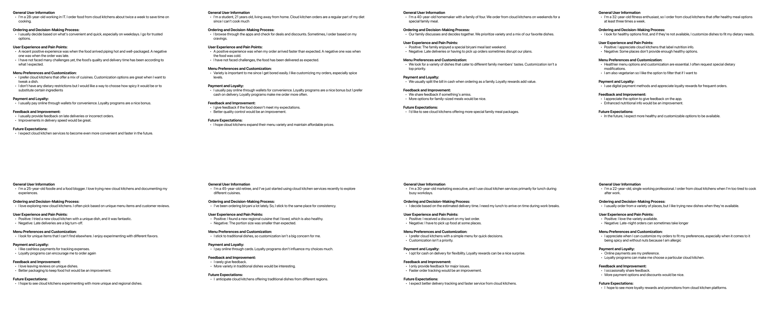
USER INTERVIEWS
Through the user interviews I was able to gain insight on 3 main things
Information they need on the app to make a decision
Pain points from start to finish while ordering and
Features they would like on the app for a better user experience pay quickly.
*Click on the image to see the interview questions and answers.
USER PERSONAS
Based on my market research, I came up with 3 personas targeting young adults with average to high-tech savviness.
USER FEEDBACK SYNTHESIS
I created groups based on similarities I gathered from the user interviews. This will help me improve my product and give me an edge over the competition.
COMMON THEMES
The affinity mapping helped me narrow down what the common themes and user expectations are.
GROUP MAPPING
I created this flowchart to quickly see what the general user expectations and needs are for using a cloud kitchen service based on how they prioritize it.
GOAL SETTING
After user & market research, I came up with user pain points, business goals, and opportunities. This helped me prioritize working on streamlining the order and payment process for this project.
MOOD BOARD
I opted to create a cool-toned mood board for a food phone app due to its associations with freshness, cleanliness, and appetite stimulation.
STORY BOARD
I drew this story board to understand the user journey before placing an order.
INFORMATION ARCHITECTURE
I created an information architecture to ensure there is a good user flow as users navigate through the website.
USER FLOW
The user flow helped me understand how the navigation should be structured to facilitate the users to order quickly.
TASK FLOW
I focused on these 2 tasks primarily since that is what will be active as we launch the website.
FEATURE SET
I categorized the features to prioritize what I want to include in this version considering the time limitations.
LOGO DESIGNING
In Udarbharan, I creatively intertwined Lord Ganesha's imagery into the 'द' character of Marathi script, symbolizing 'nourishing the belly.' This unique design fusion highlights cultural symbolism while maintaining simplicity, echoing Indian heritage. Through its user interface, my aim is to evoke pride and connection by elegantly blending tradition with modernity, emphasizing the profound significance encapsulated within the minimal yet impactful visual representation of 'da' and 'द'.
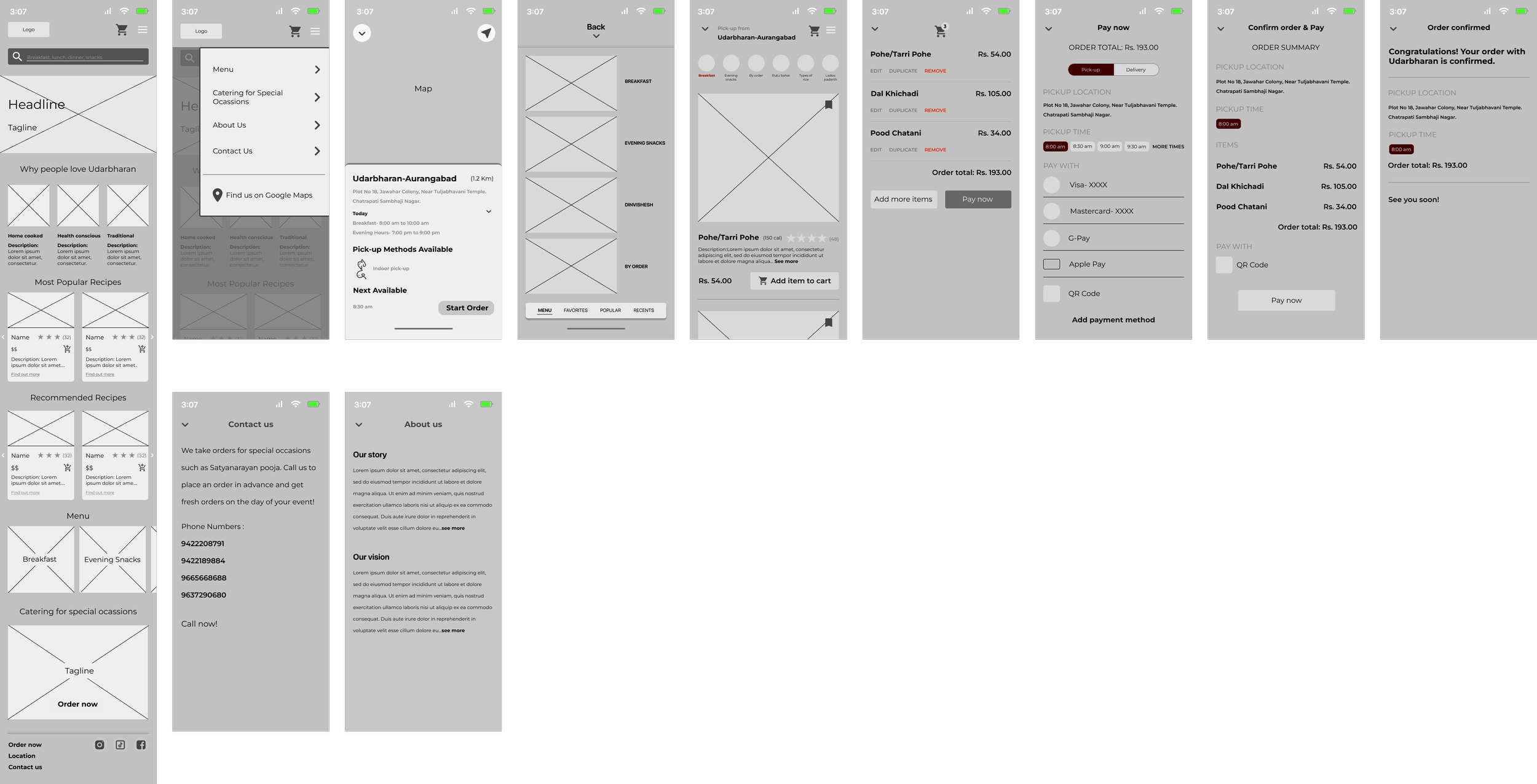
LOW FIDELITY WIREFRAMES
I opted for low-fidelity wireframes in Udarbharan for rapid concept exploration. Simplified layouts helped test design elements efficiently, ensuring alignment with cultural symbolism and user experience goals. This approach facilitated swift ideation and iteration, aligning with the project's cultural narrative and visual identity.
MID FIDELITY WIREFRAMES
Mid-fidelity wireframes in Udarbharan bridged initial concepts with detailed designs. Adding essential visual elements allowed clearer visualization while enabling discussions on functionality and layout. They balanced cultural narrative with functional interface design
COLOR PALETTE
The colors F1FEFF (light blue), 00AFBA (turquoise), and 003A3E (dark teal) serve as an excellent palette for a food app due to their psychological associations and usability. This palette evokes a fresh, appetizing, and well-organized aesthetic, enhancing user experience and encouraging engagement with the app's content related to food, cooking, or dining experiences.
TYPOGRAPHY
SF Pro Display has a modern aesthetic and exceptional readability, ensuring a seamless user experience. Its elegant yet straightforward design enhances visual appeal while maintaining clarity, ideal for presenting diverse food content in a user-friendly manner.
HIGH-FIDELITY WIREFRAMES
High-fidelity wireframes brought detailed visuals to the app. The user feedback refined its appeal and usability, influencing layout, colors, and interactive elements for a more intuitive and engaging interface.
FINAL PROTOTYPE
Udarbharan's final prototype elegantly merges cultural symbolism with intuitive design, This visually engaging platform celebrates tradition through a modern, user-friendly interface.
RESULTS AND NEXT STEPS
Results:
Enhanced Visual Appeal: User feedback highlighted the need for vibrant color accents to improve overall aesthetics.
Improved Navigation: Suggestions led to refined navigation elements, ensuring seamless user flow within the app.
Enhanced Interaction: Feedback influenced the addition of interactive elements to elevate user engagement.
Clarity in Information Presentation: Insights guided adjustments in content layout for clearer information delivery.
Next Steps:
Refinement of Visual Elements: Implement color adjustments and visual enhancements as per user feedback.
Iterative Testing: Conduct further usability testing to validate navigational improvements.
Interactive Prototyping: Develop interactive prototypes to validate newly introduced interactive elements.
Fine-tuning Content Layout: Continue refining content layout based on user preferences to ensure optimal information presentation.


