Mendel Academy
Website and Product Development for a M(Ed)-Tech start-up to improve SEO and increase Student Enrollment on the website.
CAse study contents
Project overview
Ideation & Concept
Conclusion
Design Phase
Research phase
Development & Implementation
Project Overview and Challenges
BACKGROUND
Since joining Mendel Academy in 2020, I've played a pivotal role in transitioning our medical exam prep services to the digital realm in response to increased pandemic-related demand. To achieve this, I acquired UX/UI design skills, focusing on creating a user-friendly website for streamlined course enrollment and information access.
In a comprehensive website review, I identified issues like inadequate information, user flow complexities, and disjointed UX/UI design, all of which hindered student engagement and enrollment. To address these challenges, I conducted:
pattern analysis
aligned our efforts with the company's vision
competitive research, and
identified key user information
My hypothesis centers on the idea that by structuring frequently sought-after information coherently and ensuring website accessibility, we can significantly boost user retention and engagement, expediting decisions for prospective course enrollees.
Timeline:
February-June 2023
Team:
Chief Educator/CEO
Product Manager
Web Developer
Marketing team
Sales Lead
DESIGN CONSTRAINTS
Tools:
Figma
Icons 8- Illustrations
Google Analytics
Redesign UX and UI of the website and the product- services, syllabus, and description of services in 2 months.
Limited budget and resources.
Leading a team of 5 in India, time coordination was challenging.
The online payment account was not set up and kept getting delayed due to bank paperwork issues in India. This required users to contact the educator and pay him directly.
Understanding the need for re-designing
REDESIGNING
Quick rewind: I redesigned the website for Mendel Academy to enhance user experience and facilitate easy access to class registration information. I implemented strategies to improve user retention and engagement, resulting in a significant increase in website interaction and student inquiries.
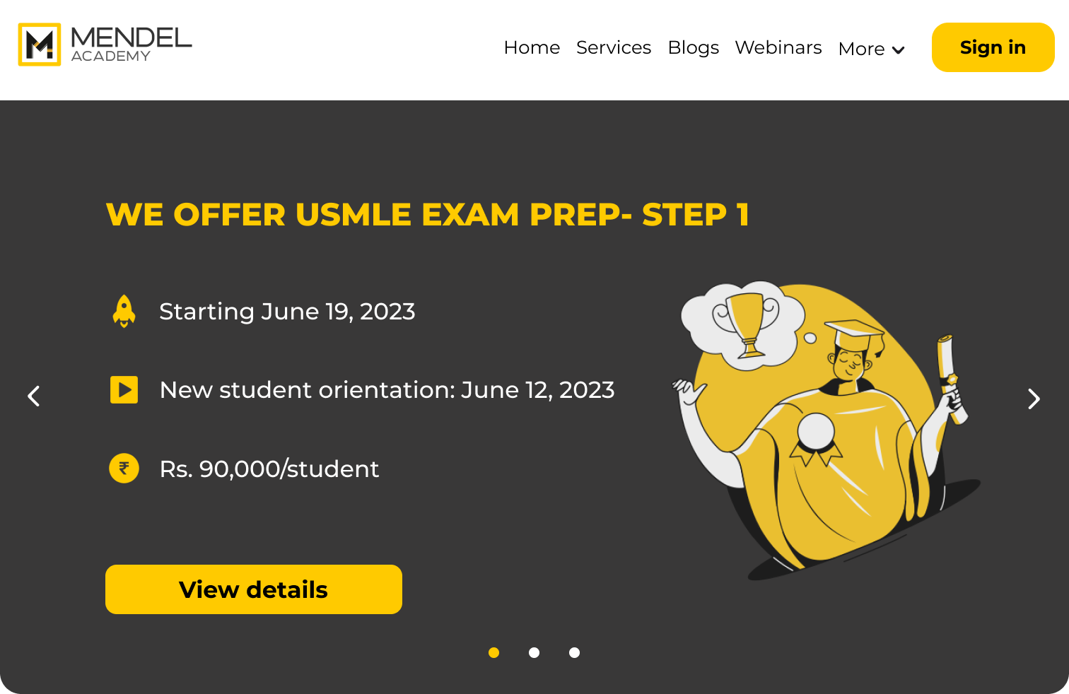
Before
Problems:
Visual dissonance- colors & typography are incohesive
Enrollment ambiguity-unclear content & icons
Brochure-like appearance
Navigation challenge
Distracting logo
Information deficiency for services
Draft 1- Pilot in April, 2023
Problems:
Limited resources: Slow content updates.
Typography and color scheme: Needed improvement.
Content about services: Insufficient.
CTA visibility: Low for course registration.
Effective features and outcomes:
Webinar sign-up flow in the hero section: 150 sign-ups, 52 attendees.
User retention and engagement increased by ~45% with better user flow and accessibility.
Enhanced brand awareness
Let’s take a look at the plan to achieve quick and effective results.
Research Methodologies
RESEARCH PLAN
Data analysis- Understand current demographics, user traffic, user retention, which device is used, and what pages are popular
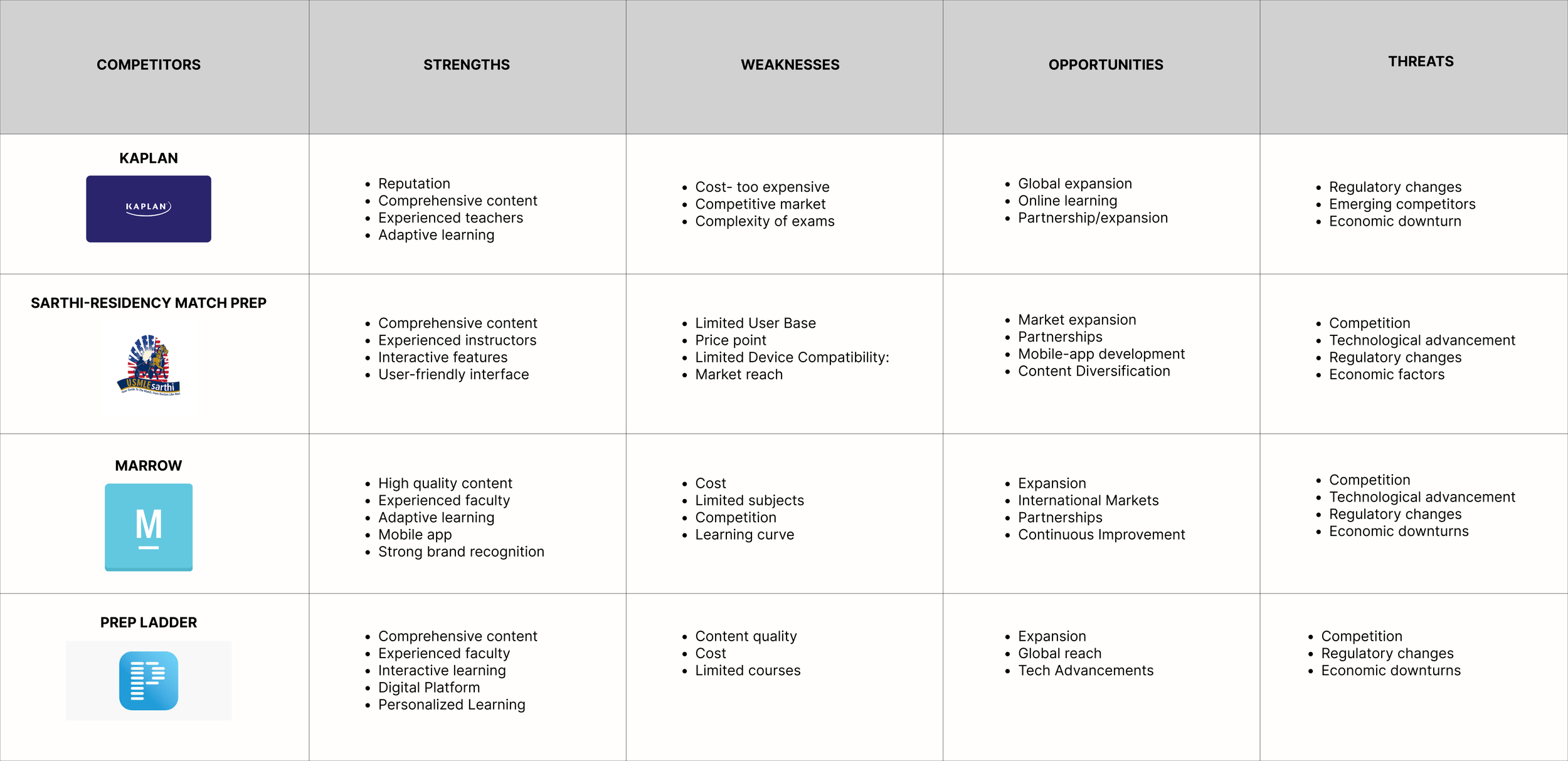
SWOT analysis- Analyze what is working for competitors and opportunities for growth
User interviews and surveys- Gauge what users need to enroll in classes and what is and isn’t working right now
Task-based usability testing- Observe how users navigate through the website and what the roadblocks are
Participants
Anyone interested in coaching services to take medical entrance exams for post-graduation
Timeline
2 months
Research Objectives
How easily can students enroll for classes now?
What are the criteria for the users to make the decision to enroll?
When and why do they visit the website?
What brings them to Mendel Academy?
DATA ANALYSIS
Here are my main takeaways from using Google Analytics for the original website: create a responsive design, provide additional information about exam prep, applications, and courses offered, and increase awareness about Mendel Academy worldwide.
COMPETITOR ANALYSIS
Subscription and pay-per-course models to provide a user-centered experience.
User-friendly web and app designs, offering detailed information and interactions that drive enrollments
40% offer phone-based services
30% AI- In-depth analysis of mock tests, mock exams, interactive quizzes, etc.
Opportunities
Increase digital & social media presence
Offer prep for exams around the world, not just USMLE
Offer competitive but affordable prices
Growing demand for residency match prep
Incorporate subject-wise prep
In addition to the listed competitors, I conducted research on several other direct and indirect competitors, and my comprehensive findings are as follows:
Strengths
USER INTERVIEW METHODOLOGY
User interviews- Understand when, why, and how they access the website; their pain points; and scope for improvement
User surveys- I surveyed ~40 people to gather data on various factors like navigation, speed & performance, functionality, etc.
Task-based usability testing- Observe roadblocks for users while navigating through the website and what they expect.
Number of participants- 50 participants
Age group- 18-65 years old
Participants- Medical Students, American Medical Graduates (AMG), International Medical Graduates (IMG), Postgraduate students, Parents of students
USER INTERVIEWS
To gain deeper insights into user needs regarding course registration and desired services, I conducted user interviews and surveys. This helped me understand what information users prioritized and needed before enrolling in courses. Additionally, I recorded their desirability towards current services and services they would like to receive. To organize the diverse interview findings effectively, I created an affinity map.
USER FEEDBACK SYNTHESIS
I then conducted task-based usability testing which was instrumental in uncovering user needs and identifying pain points within the user journey. Synthesizing insights from interviews, surveys, and usability testing provided a comprehensive understanding of the necessary services, their ideal structure, and the essential information to present on the website. This approach aims to streamline the registration process by equipping students with the knowledge needed for quick and informed decisions.
USER PERSONAS
The combination of secondary research, market analysis, and user research played a crucial role in my ability to pinpoint specific user personas to target during the design of both services and the website. This approach ensured that we were catering to our target demographic and being inclusive to expand internationally.
Time to build a solid foundation
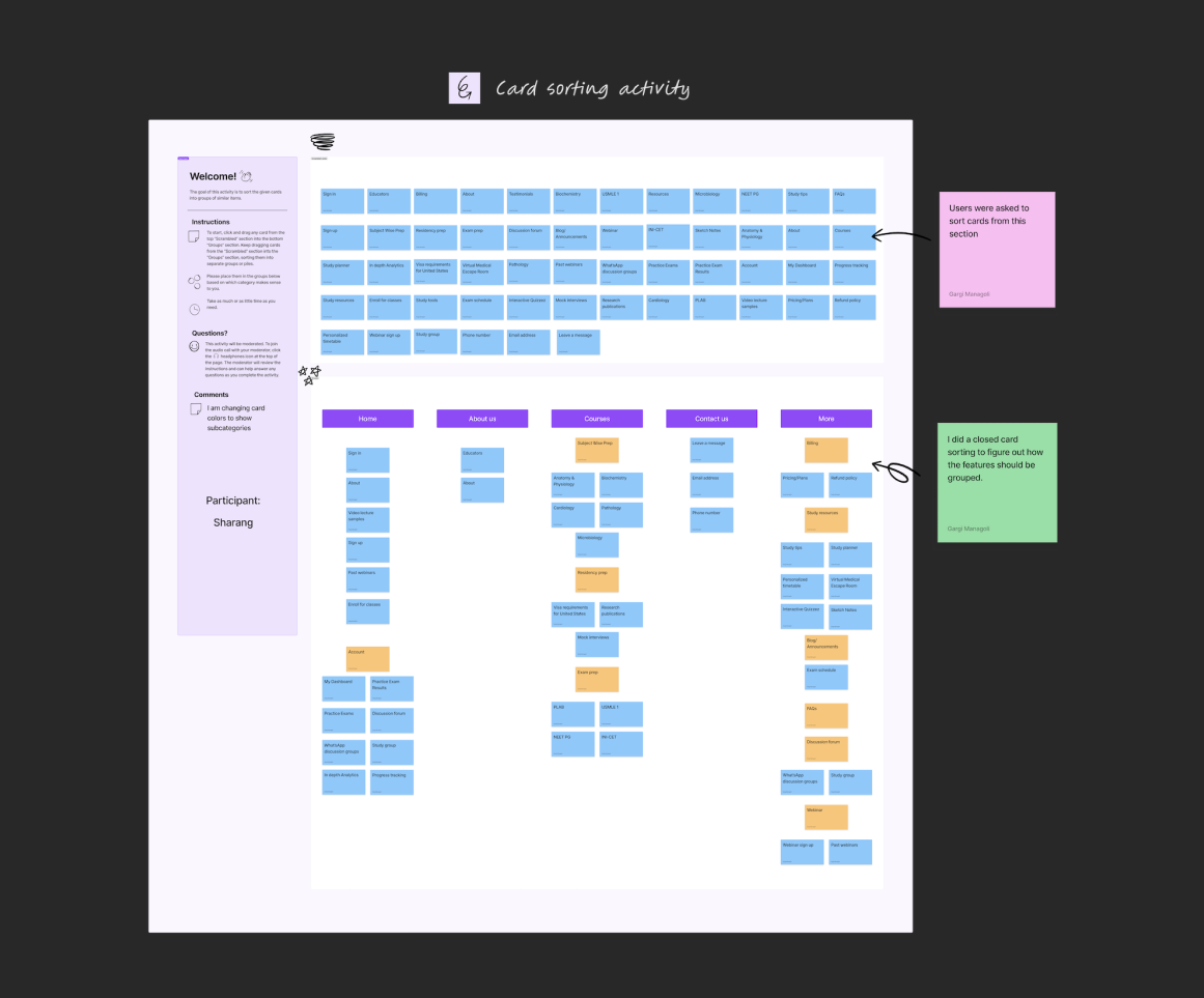
CARD SORTING
In February 2023 the team decided to do a soft launch of the website by March 8th because, from past trends, that’s when students typically start inquiring about exam prep services. This is because they are finishing their internships and now can dedicate time to study for their entrance exams which are required for post-graduation.
I did a closed card sorting so I could quickly get a sense of how users would structure the information and user flow with the information I learned from my research. I asked 8 people to participate in the card sorting which also included internal stakeholders.
FEATURE SET
The card sorting helped me prioritize which features I should incorporate into the website in the given time I had before the soft launch. I primarily focused on the home page and exam prep services pages so students can have all the information they need to register for courses.
INFORMATION ARCHITECTURE
The user flow was helpful to preempt how the users would navigate through the new features on the website.
TASK FLOW
I then created task flows to know more specifically how users would navigate through a new task and what that user journey would look like.
Using Google Analytics I was able to see where the user flow was flawed and what page the users were dropping. In order to ensure that user retention and engagement are longer so they can enroll for courses, I wanted to design a coherent information architecture.
USER FLOW
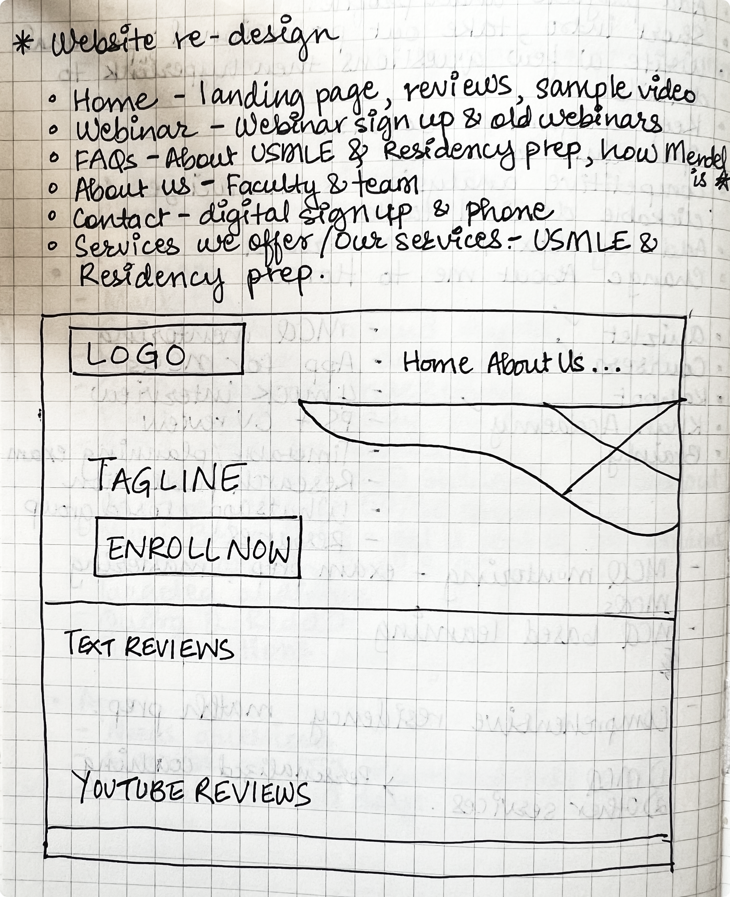
LOW-FIDELITY WIREFRAMES
Below are some low-fidelity wireframes to visualize how I wanted the structure to look on the website and app and where I wanted to place certain features to ensure it was user-friendly and addressed their pain points.
MID-FIDELITY WIREFRAMES
I further developed the wireframes to see how it would look on the desktop and mobile. I also conducted usability testing with internal stakeholders to brainstorm and come up with the best option while keeping our business goals in mind.
Aligning business goals and user needs
GOAL SETTING
User feedback and market research enlightened me to many opportunities that could improve their experience and align with the company’s vision and goals.
Business Goals
Increase SEO
Increase student enrollment
Increase brand awareness
Improve retention rates on website and social media pages
Enhance user experience
Establish and maintain partnerships with medical schools/research publications
Opportunities
Offer subject-wise, residency match, and exam prep for services
Mobile app
Interactive study material
In-depth performance analysis
Virtual escape room- study tool
Making it visually appealing
MOOD BOARD
I approached the mood board with a more minimalist, light-colored theme that includes soothing blues and greens, resonating with the medical field. Pastel tones will feature in website illustrations, while the remaining backdrop stays white, ensuring clear legibility for SF-Pro typography and impactful imagery. This color palette strikes a balance between minimalism and engagement, ideal for Ed-Tech.
DESIGN SYSTEM
I created a design system to bring uniformity throughout the website. I prioritized this so if anyone internally or new were to take over, they could keep the web design consistent throughout.
Putting all the pieces together
FINAL PROTOTYPE
With all the user feedback and data analysis, I was able to come up with a coherent user flow. Although the website will be iterated further as we get more user feedback and analyze user behavior, for this case study, I concluded the project at this stage.
RESULTS
1. Landing page- quickly see what courses & services are offered and register for courses.
*All screen recordings are from the current and active website: www.mendelacademy.com
Effective:
User retention on the landing page increased by 83% in a month
User engagement: Going to each page through Subject Mastery, Exam Prep, and Residency Match Prep by clicking Register Now
Student inquiries went from ~ten per month to 50-100 per month within the last three months via Register Now and Contact Us
Enhanced website design and user experience, driving a ~470% surge in Organic SEO within one-month post-launch
Problems/Constraints:
Since we had a limited budget, the web developer could not exactly replicate or align with what I had designed. We are continuing to iterate it until the desired results are reached
2. Get more information about a service and register.
Effective:
Achieved rapid enrollment of 150 students within a month
Onboarded 25 students for each service within a three-month launch window
The product was curated to offer more support for residency match and subject-wise prep, in addition to exam prep. Student inquiries went up from 5-10/month to 50-100/month within a month
25 students registered within the first month
Problems/Constraints:
Page loading time is too long
Limited funding and resources are hindering our progress in making sure the programming matches my designs
The pricing section needs to be revised on the website and match what I designed in Figma
Payment gateway has not been set up so the user flow for registering for classes stops at the Register Now part
MOBILE APP
Because most of our users were accessing the website using a mobile, I created a responsive design to cater to those users.
Effective:
Easily access content on mobile
Mobile users increased by ~80%
User retention on the mobile increased by 35%
Problem/Constraints:
Due to limited budgeting and lack of staffing, developing this further has been slow
Concluding the project & next steps
REFLECTION
My objective to build a responsive design and provide information about services so students can quickly register for classes showed a lot of positive results. Analyzing what worked for competitors helped me get through the content quickly.
Because Mendel Academy already had good word of mouth, once we improved accessibility to enroll for courses, we observed a significant increase in student inquiries, user retention, and user engagement on the website.
NEXT STEPS
This project will continue to be iterated until we can enroll at least 100 students/month this year. As we continue to build the product and website, here are the next steps I would like to focus on.
Complete designing all pages- Subject Mastery, Blogs, and About Us
Integrate practice quizzes, interactive content, and games on mobile app and website
Add study tools for students
Dashboard to track progress
Introduce community-building/networking opportunities


